In “Make It Yours: Configuring SIGHTS Part 1” I showed you how to configure a basic SIGHTS-based robot. In this, the second part, I’ll go over the more complex configuration of Interface and Sensors.
The Simple Bits
Ok, I lied. There are a couple more basic bits, but I left them out of the previous blog because they come under the heading Interface. If you spent some time exploring the config after my last post, you might have realised that these are Notifications and Cameras.
Notifications
Notifications appear as toast alerts on the bottom left side of the page. They’re enabled by default and are displayed for 7 seconds. If they disappear too quickly to read or you find they clutter up the interface for too long, you can adjust the Notification Timeout to your preference.
If you want to disable them altogether, you can do so by unchecking Enable Notifications.
Cameras
Camera configuration is also relatively simple. SIGHTS supports 4 cameras, which is conveniently the number of cardinal directions. You can individually configure a Front Camera, Back Camera, Left Camera and Right Camera.
Each camera has its own Enable checkbox and a Camera ID. If cameras are displaying in the wrong areas, you simply need to swap the Camera ID associated with the cameras.
Theme
The accent colour of the interface can be changed from the default S.A.R.T. Orange to a colour of your choosing with the system colour selector. The advanced editor can be used to input a HEX colour code directly.
Graphs
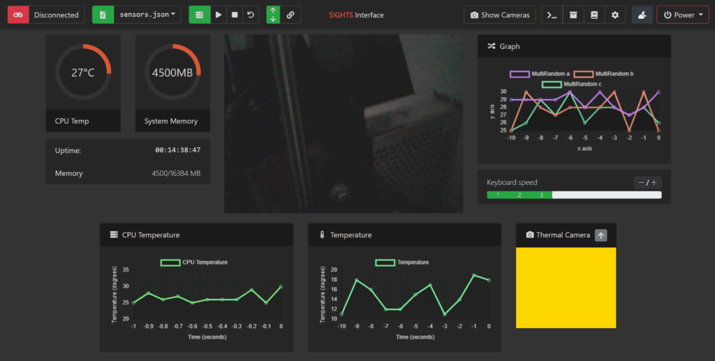
Now we come to what’s left. The only remaining settings to talk about are Graphs (in Interface) and Sensors. In simple terms, Graphs are used to display sensor data on the interface. This means when you create a sensor, you’ll probably need to create a graph too.
At the time of writing, SIGHTS is bundled with 4 types of graphs that can be used to display your sensor data, with the ability to easily create more. Let’s go through them:
Line Graphs
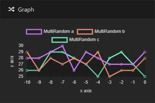
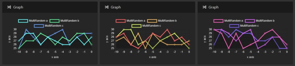
Line graphs are one of the most interesting ways to present your sensor data over time. They are also unique in the fact that a single line graph can display data from any number of separate sensors.
You can easily customise the title, axis labels, icon and y-axis min/max values from the config.
New: You can now choose a colour theme for each line graph! Themes are “Ocean”, “Summer” and “Magic”. You can set a theme per-graph.
Percentage Circles
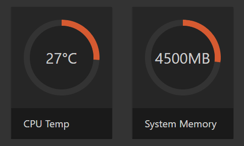
Percentage circles are perfect for representing data that has a maximum value. If the sensor is reporting its maximum value, the entire circle will be filled, and if it is detecting its minimum value, the circle will be empty (and of course, everything in between).
You can customise the title, units, text style and maximum value* to ensure your data is displayed flawlessly.
*Some sensors such as all the host resource monitors (CPU, disk and RAM usage as well as CPU temperature) can auto-report their maximum value, meaning you should leave “maximum value” blank unless you need to reduce the sensor’s maximum value. You can use the interface logs to check if a sensor is not providing its maximum value.
Text Boxes
Text boxes are the simplest way to display data; Simply, as the name suggests, as text.
They’re still customisable, allowing you to change the title, with optional units and maximum value. Perfect for sensors that report a simple, readable value.
Thermal Cameras

The thermal camera graph is designed to display data specifically from thermal cameras. It also has a special feature allowing you to overlay it on any enabled camera.
Like the other graphs, you can customise the title. You can also customise width and height in pixels, making it suitable to display data from any type of thermal camera.
Additionally, you can set the default overlay settings, including default camera, opacity, x-scale and y-scale.
Sensors
Sensors are configured to send data to a graph. All sensors can be enabled or disabled, have a name, an update period, and a list of graphs they display on. Apart from that, sensor configuration can be very specific to the type of sensor you’re using.
To de-mystify the configuration of sensors and graphs, there’s no better way than a few examples.
There are a couple of sensor wrappers designed to generate random data. You can use these as placeholders when you are testing the interface and practising setting up sensors. We’ll use these in the examples.
Example (no sensor hardware required)
Let’s create an “ambient temperature” sensor displayed on a line graph. I’ll create the graph first, but you could really do it in any order.
To do this, we navigate to Config > Interface > Graphs and click the add (+) button. Select “Line Graph” from the dropdown list and click the arrow to expand its options.
First, we need to give the graph a Unique ID. This ID is used by the sensors to identify the correct graph to display on. I’ll call this one “ambient_temp”.
The next setting you need to modify is Location. This is the div element on the interface where the graph will appear. There are three locations that we recommend trying: #btm_view_sensors, #right_view_sensors and #left_view_sensors. I’ll use #btm_view_sensors for this graph.
Next, we can set a Title for the graph. This is a pretty title that will appear on the interface, so I’ll call it “Ambient Temperature”.
The icon next to the title is a Font Awesome icon. First, browse or search for an icon you like, and then enter the name in the Icon field. In this example, I’m using the icon “thermometer-half”.
We have a nice title, but to really impress our middle-school teachers we also need to label the axes. I’m setting the X-axis Label to “Time (s)” and the Y-axis Label to “Temperature (°C)”.
The Y-axis Minimum and Y-axis Maximum are optional, but they do help make your data more presentable. We’ll set it to some realistic values for the range of ambient temperatures, such as 0 and 50.
Finally, we set the period. This is how often the graph updates, in seconds, and it should be the same as the sensor’s update period. Since ambient temperature doesn’t change very quickly, I’m setting it to 5 seconds.
Just for interest, if you take a look at the “Advanced Editor” tab, the definition for this graph looks like this:
1 2 3 4 5 6 7 8 9 10 11 12 | graphs: - uid: ambient_temp type: line enabled: true location: '#btm_view_sensors' title: Ambient Temperature icon: thermometer-half x_axis_label: Time (s) y_axis_label: Temperature (°C) y_axis_min: 0 y_axis_max: 50 period: 5 |
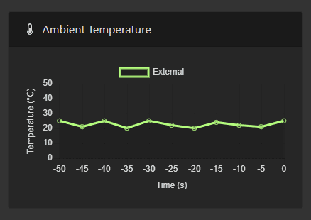
If we save the config and restart the SIGHTS service, our graph will appear on the interface. It won’t update or display any data yet, since there is no sensor connected to it.
![]()
So let’s add that now! Navigate to Config > Sensors and click the add (+) button. We’re making a fake sensor (just to practice), so choose “Random Data” as the sensor type. Click the arrow to expand the options.
Give the sensor a name. Let’s pretend it’s an ambient temperature sensor on the outside of the robot and give it the name “External”.
Remembering that Update Period should be the same as the graph as it is for the sensor, we should set it to 5.
Minimum Value and Maximum Value are just parameters for the random data generator to make your fake data a bit more realistic. Let’s say it’s a nice day out, with a min of 20 and max of 25.
Now for the fun part: We need to tell the sensor where to display. Of course, we want it to display on our previously created graph, “ambient_temp.” Click the add (+) button to add it. You’ll notice how you can add more graphs to the list: Yes, SIGHTS does allow you to display data from a single sensor on multiple graphs.
Now, save the config and restart the SIGHTS service. The graph will start receiving the data from the sensor!
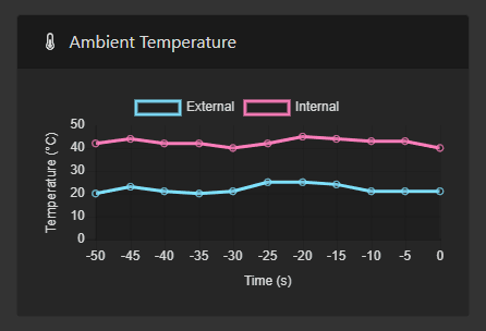
You may recall from earlier that I said Line Graphs can display data from multiple sensors. Let’s try that out now.
I’ll make another fake temperature sensor (using Random Data) called “Internal”. This is a temperature sensor inside the robot where the temperature will be higher due to the confined space and heat output of the electrical and mechanical components.
I just fill it out with similar settings to our previous sensor, and when it’s time to choose the Display On graph, I use the same graph as before – “ambient_temp”.
Once again, we restart the SIGHTS service. Our new graph will appear, showing data from both sensors!
We’ve successfully created our first graph, and it looks pretty good. However, I would like to walk you through a more complicated type of sensor.
Some sensors, like the BME280 sensor, record multiple values. In the BME’s case, it will report temperature, humidity and pressure. We call these “multi-sensors”.
SIGHTS includes a MultiRandom sensor for testing. It’s the same as a Random sensor, except it sends 3 values to the interface rather than 1. We’ll use this to learn how multi-sensors work in SIGHTS.
Once again, we need to create some graphs to display this sensor data on. We could create a line graph to display all three values on the same graph, but since they don’t have the same units (think of temperature, humidity and pressure on the BME280 sensor), it would be hard to interpret the graph.
Instead, we’ll create two separate Percentage Circle graphs and a text box.
Again, we go to Config > Interface > Graphs and click the add (+) button. Select “Circle Graph” from the dropdown list and click the arrow to expand its options.
I’ll give this one the Unique ID “bme_temperature” (the other circle can be “bme_humidity” and the text box will be “bme_pressure”).
I’ll put it in “#left_view_sensors” (keeping in mind you can use “#right_view_sensors” or “#btm_view_sensors” as well).
Maximum is an important setting for circle graphs since it determines how full the circle is for any given reading. This is generally set to the maximum reading expected, however, you can set it lower if you want the circle to appear full for lower readings. Even if the circle is full, the text inside the circle will still report the actual value. As I mentioned before, many sensors automatically report their correct limit as the maximum value. I’d recommend leaving mmaximum empty and checking the interface logs to see if the sensor is not reporting a maximum value.
Now for the bme_pressure textbox. Start by creating another graph and selecting “Text Box” from the dropdown list.
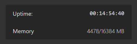
I’ll give the text box a special location “#sensors_textbox”, which will append it underneath the uptime textbox.
I’m setting the Title to “Pressure” and the Units to “hPa”, but leaving the optional Maximum field empty.
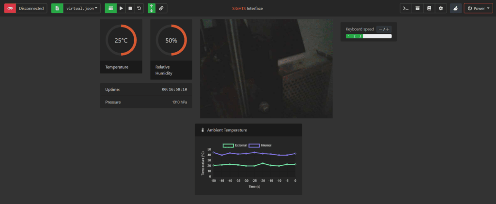
After saving our config and restarting the SIGHTS service, our interface is starting to look pretty neat!
Using Real Sensors
The example above only uses fake, randomly generated data. However, the process is the same for real sensors – you just need to connect them to your robot first!
If you don’t have any sensors for your robot, you can still try using the sensors it already has – the ones in the computer hardware. SIGHTS comes bundled with sensor wrappers for RAM, CPU and disk usage as well as CPU temperature. Perhaps you could try them out with Percentage Circle graphs!
Parting Words
Well, here we are at last! After reading these two tutorial blogs, you can now configure a SIGHTS-based robot to your exact personal specifications.
I hope you find the software useful for your own projects.
In the spirit of open source, we’d love to hear about any contribution you can make to the SIGHTS project, whatever it may be.
If you discover issues in the software or have an idea you’d like to see, feel free to open an issue.
If you’re an experienced developer or just starting out coding, you’re more than welcome to fork the repository to work on any of the open issues, then submit a pull request to get your changes merged back into SIGHTS! I look forward to creating an even more awesome piece of software with you.