The site we got our original logo from updated their commercial use license, meaning we need to update our logo.
Fortunately, this gives us the chance to put some more thought and effort into it!

Here’s our old logo. It represents innovation and synergy and empowerment… Yeah. It doesn’t really represent us.
We had some other designs, but most of them didn’t fit exactly with what we wanted. Some were too complicated, didn’t represent us, or didn’t use our trademark orange colour.
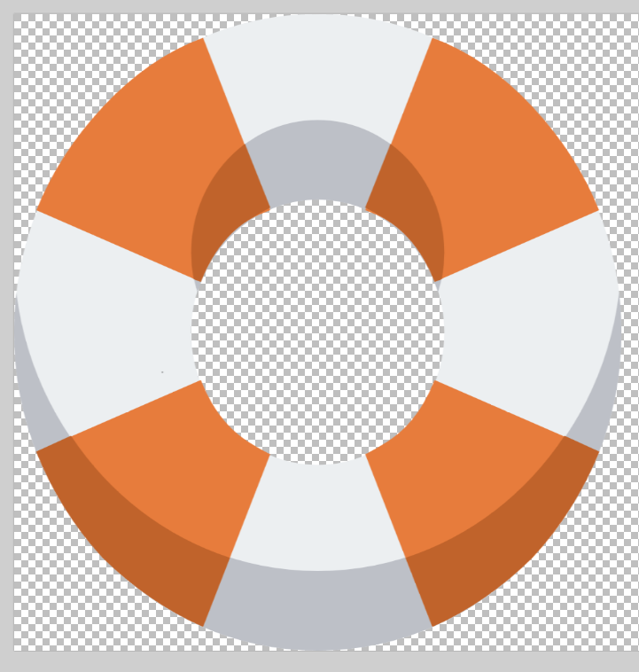
Firstly, we needed an element that represents rescue – such as a lifebuoy.
Here’s one by artist paomedia – in the public domain, with commercial use permitted.
![]()
Now for an element that represents robotics. I took inspiration from robot arms such as this one:
![]()
After a bit of colour adjustment, the lifebuoy matched our colour theme:
Duplicating the robot icon and reducing the saturation gave it the same theme of the lifebuoy. I filled in the gaps with white and grey to make the arm one continuous object. I made the colour slightly different to the buoy so it could stand out.

Finally, I inserted the arm into the buoy and removed the base so it would appear to be reaching out from inside.
![]()
I messed around with the colouring a bit so the arm would stand out more.
![]()
![]()
![]()
After putting it down to a vote, we decided on the logo with the red arm.
Finally we have a logo we can be proud of!
![]()